Being Adolph Gasser
An independent documentary more than 20 years in the making. I designed and built its website to tell the story, introduce the team, and keep audiences in step with the release.
InDesign, Photoshop
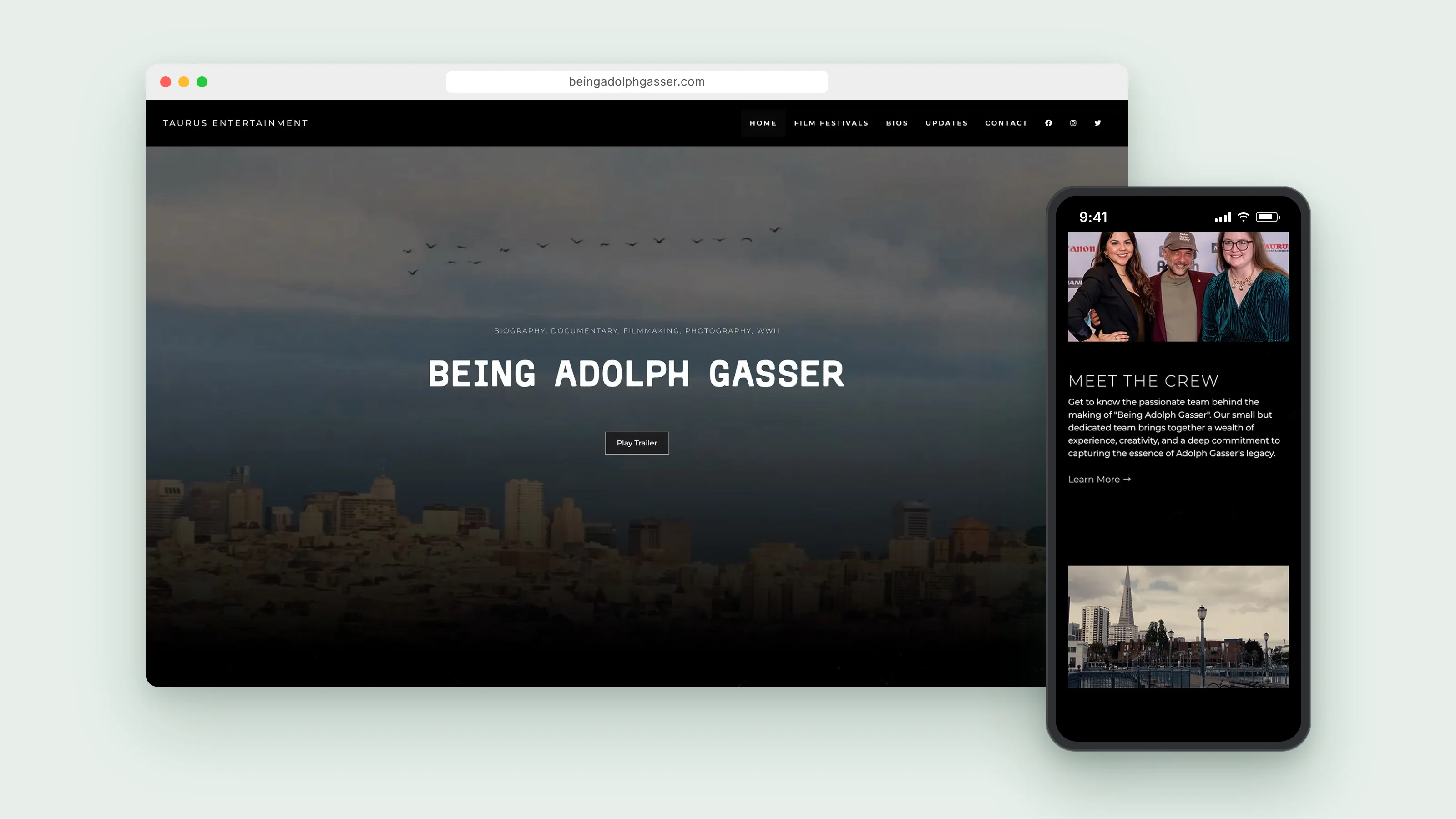
Creating a film documentary website.
Being Adolph Gasser follows a San Francisco camera repairman, inventor, and WWII veteran whose shop supported Bay Area photographers and filmmakers for decades. The film needed one place to share that story, introduce the people behind the film, and share screening information.
I designed and built the site from scratch. The look takes its cues from the film: dark, cinematic framing, archival photography, and editorial type that ties the two togehter. It's built in custom HTML and CSS and hosted on GitHub Pages.
View the live site ↗What the film needed.
The film was 9 months away from completion, but no central home for its story. With a premiere ahead and festivals to follow, the team needed a site that could win over first-time visitors and be a source of updates and important news.
Most people arrive knowing nothing about Adolph, and the website needed to intreuge visitors to want to learn about his story.
Moviegoers and festival audiences need a place for dates, locations, and tickets without digging through social posts.
Press, supporters, and the film community look for who is behind the project and what's happening next.
Setting the tone.
I mapped the site around a few questions: What is this film? Who made it? Where can I see it? That shaped the launch pages, Home, Bios, Updates, and Contact, with room in the navigation to add pages later.
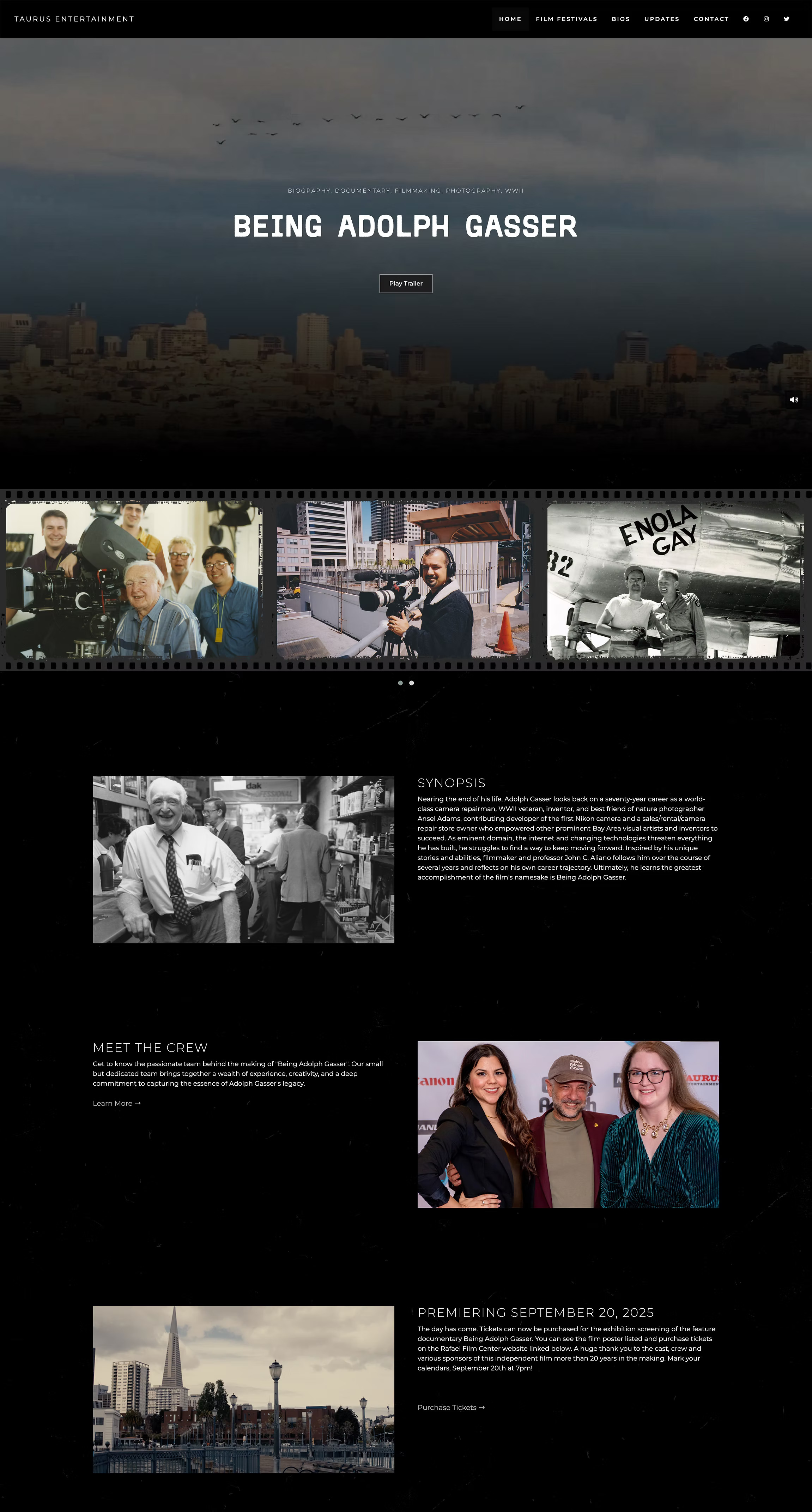
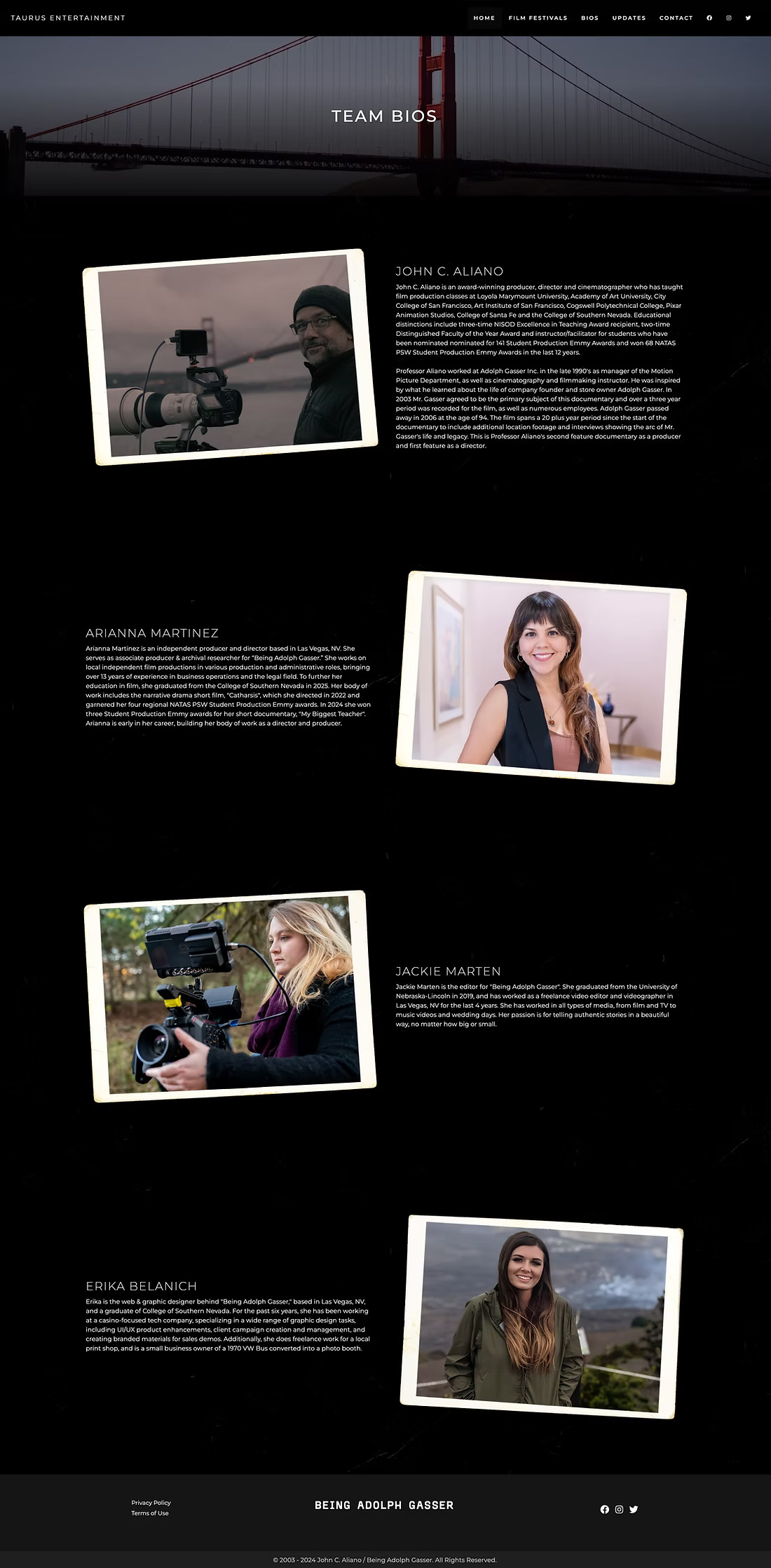
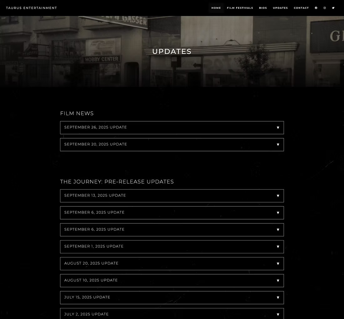
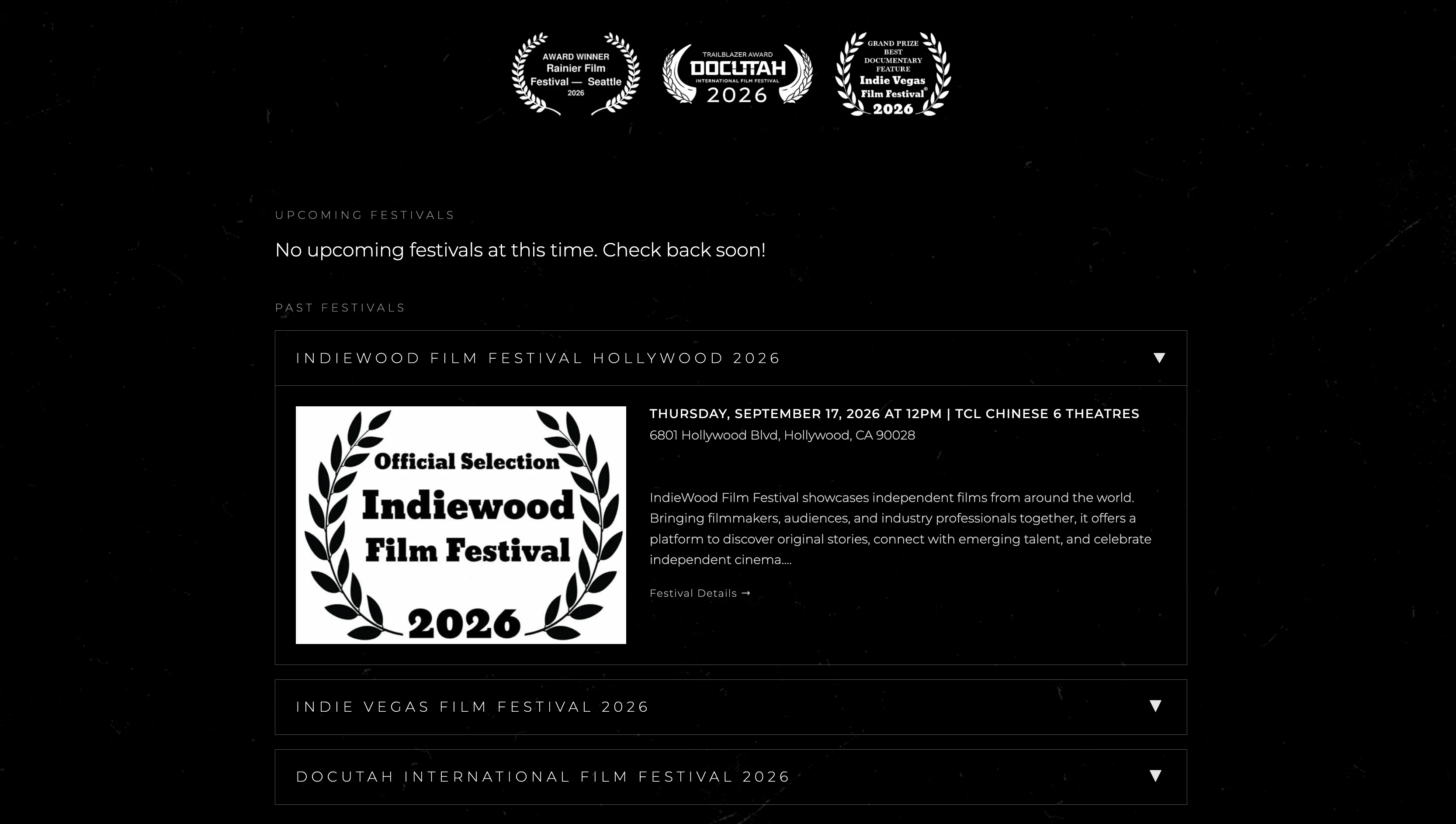
I set up the base layout in Figma, then built it in HTML and CSS. The homepage opens on visuals of the trailer, a button to view the trailer, and shares a strip of archival photos spanning 1945 to 2003 that introduces Adolph's life through images. Type and spacing stay restrained so the photography carries the mood. The Bios page puts faces to a small team, and the Updates page turns a year of pre-release progress into a dated log that's easy to follow.
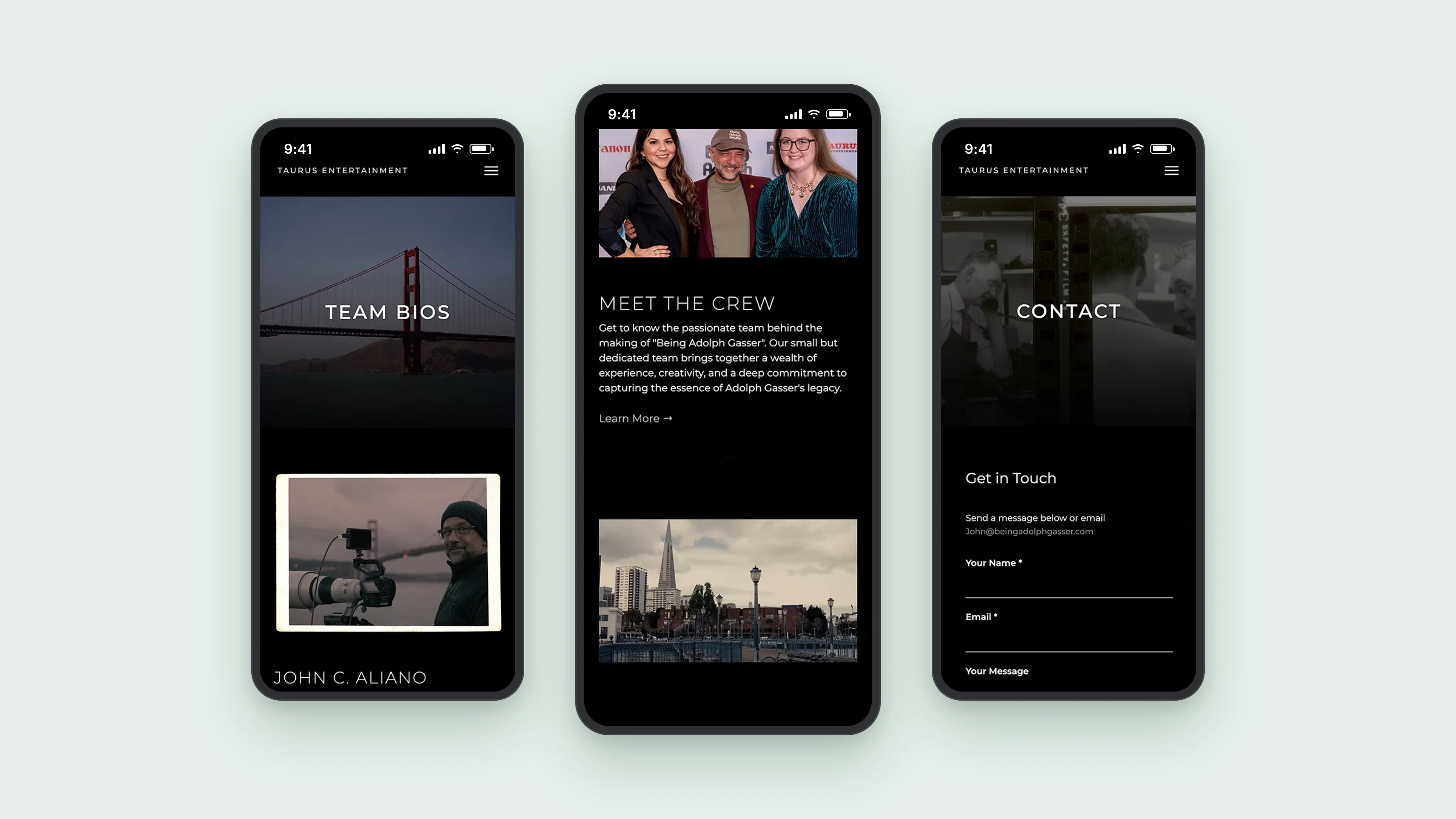
Designed with mobile in mind.
The film's social posts link straight to the site, so many visits start on a phone. Layouts stack cleanly, type stays readable, and navigation is easy use.
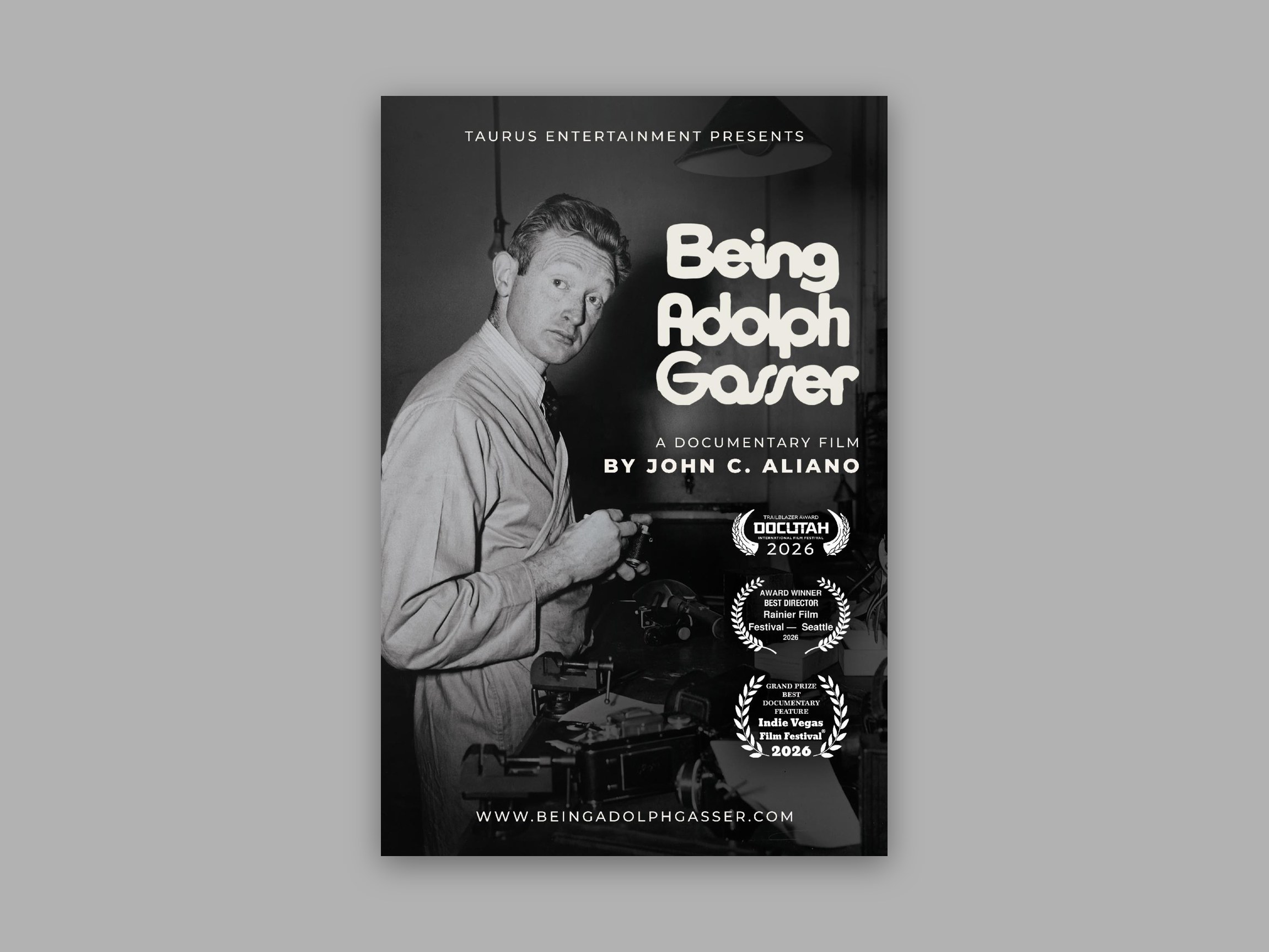
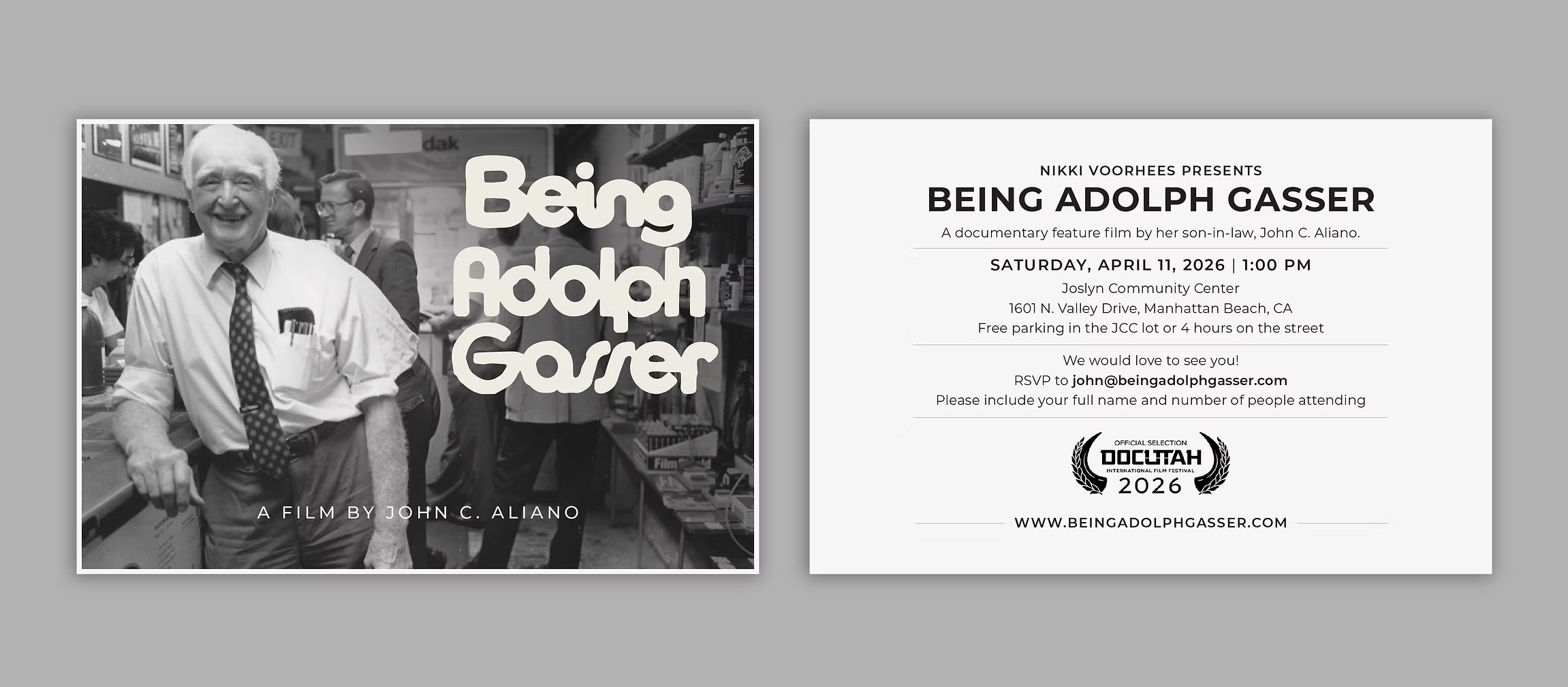
Poster & Screening postcard.
I also designed the film poster and a screening postcard that match the site's type, imagery, and tone into print.
Where it's at now.
The site launched a year before the film's premiere at the Rafael Film Center and sent visitors straight to tickets. It's still the film's home for updates and festival screenings. It was also my first full website built in HTML and CSS, so I made sure it was responsive and loaded quickly on any device. The main challenge was designing for content that didn't exist yet, so I built a structure that could grow with the film.